Wednesday, May 29, 2013

Italian Baroque (pt. 6)


I feel as though I have already provided sufficient depth of inquiry (at least for the time being) on the subject of paganism as an artistic element in Westernized or Christian art, literature, and especially poetry.  C. S. Lewis has written most extensively on the topic of Myth's power to encompass both the "sacred and profane," the divine and base, the Christian and pagan.  However, much of this writing was done in my other, literary blog, and so I shall allude quickly to it again here now with this next artist, Titian.  Let us observe the Bacchanal.
Remember Titian?  He was the artist who painted The Concert and the Venus of Urbino.  He alludes often to Greco-Roman ideals in his paintings, but that does not make them pagan, as is the case here with the Bacchanal of the Andrians.
A bacchanal denotes a raucous party held by Bacchus, who was the pagan god of wine in Ancient Greek mythology.  As tradition follows, these pagan celebrations were of the wildest nature in perhaps all literary history, almost always including drunken orgies and other rowdy "romps," as C. S. Lewis famously termed them in his Chronicles of Narnia.  In his time the professor of Medieval and Renaissance Literature at Cambridge University, Lewis saw prevalently in his studies of Malory, Chaucer, and other subjects of Medieval study the infusion of pagan aspects into Christian stories.  Perhaps most notably this begins with Beowulf and continues on to this day with books like The Lion, the Witch, and the Wardrobe.  Lewis believed that paganism and Christianity were in a way connected.  How else does one explain the prevalence of pagan elements in otherwise predominantly Christian texts and paintings during this time?  Western literature has often borrowed from the pagan as a sort of foundational, ancestral root-point from which could stem the holier, more definitive doctrines of Christendom.  Lewis suggested that the idea of Bacchus, the god of wine, was "the first, faint whisper" of something that Christianity later became literally.  Bacchus represents wine in a mythical sense where Christ turned water into wine in a literal sense.  The connections spring from this line of thought.  With this view in mind, we ought not be surprised to see paintings like Titian's Bacchanal here appearing during the Counter Reformation (the Catholics' response to the Protestant Reformation).
Though this painting features lewd images not literally promoted by the Catholic Church, this was nonetheless a painting to convey Catholic messages.  The allusion being made here is to something larger than the church itself.  It harkens back to the archetypal celebration held in tradition from the earliest ancestors of Ancient Greece.  The same idea is being communicated, just in different rites, through the passage of time.  No longer do people strip nude and get drunk on wine to party, but the partying still occurs, to put it simply.  Joy is felt through different means, but joy still exists, timeless joy that transcends contemporary custom.  Titian's painting is one of joy and celebration, hinting at the vivacious splendor and gaiety (…ha) of the Catholic Church at this time as well as the happy welcome home party awaiting any Catholic converts (recall Murillo's Return of the Prodigal Son).  Here we see some very strange things going on, but the core idea behind it is one that is still familiar to us today as it was during the 16th century.  It is the timelessness of the Greek myth, the Greek culture, often held as utopian, which resonates most powerfully, being most ancient.  Being expressed in this painting is the fundamental concept of joy, joy which is implied to be available on a divine level for those who would join the Holy Roman Empire.
It's often a difficult connection to make.  One almost cannot imagine a painting like this one or Botticelli's Birth of Venus being put on display in such a celibate and legalistic place as the Vatican.  The reason is that the actual, physical practices of the paintings are not being regarded (i.e., the nudity, drunkenness, and…you know…whatever else is going on here…); rather, the age-old ideas being expressed by those practices is the core of these works of art.  C. S. Lewis did the same thing in The Chronicles of Narnia when he added such scenes of "romping" and partying, often including literal references to the Greek and Roman gods.  He is not suggesting we all participate in specifically pagan rituals.  It is to say that Christians experience joy as well—that joy is not a monopolized experience to be held by one people, but that someone else can come along, take that concept, and make it his own.  Lewis made the pagan bacchanal celebration almost Christian by placing it under the very Messianic character of Aslan.  The ancient myths of parties were fulfilled in Aslan, and the reference to the classical myths merely work to show the historical totality of the concept.  Here, too, joy is tacked under the name of the pope in the Vatican to assert the joys of embracing Catholicism.
If this doesn't make sense, don't worry; we will get more into it later on.  As we will see, there is some trend for whatever reason for art through the ages to consistently revert back to Greco-Roman ideals, as if to idolize that time period and that historical culture.  Greek myths, Roman architecture, etc. will appear again and again nearly as often as Keira Knightley appears in movies these days (seriously, she's in all of 'em).

Monday, May 27, 2013

Italian Baroque (pt. 5)


Bernini's other famous work is his more controversial sculpture of The Ecstasy of St. Theresa.
The story of St. Theresa was that, in a vision, an angel pierced her heart with a fire-tipped golden arrow, symbolizing God's love.  In the statue here, the angel and the saint are carved in white marble, and the background is golden rays coming from above.  The scene is lit overhead by a window built into the Vatican wall.  The figures appear to be floating freely in the space, don't they?
Much has been made of the artwork's sexual undertones.  The arrow is at first an obvious phallic symbol, targeting a swooning female whose facial expression indicates one of euphoria.  And although we cannot see inside of this cold, statuesque Theresa, Bernini put his sculpting genius on display with his treatment of this subject.  We do see the ecstasy of St. Theresa, not merely in her face, but in her entire form, covered as it is in wavy, flowing robes.  The drapery of the nun is surging with energy and motion that indicates the electric activity being felt on the inside.  Bernini takes a subject of spirituality and infuses it with more realistic, human, almost base descriptions, as if to convey the divine love of God as a very carnal, sensual phenomenon.  If you would ask how to interpret such a crossover, the resulting discussion would fill many more pages which I will not trouble to venture down at the moment.  It is possible, however, once finished with our overview of art history, to then go back, ask questions, discuss, and focus in on the specifics that were left behind.  For now, we should press on.

Thursday, May 23, 2013

Italian Baroque (pt. 4)


But now for the definitive Italian artist of this period in art history: Bernini.  It was Bernini who, together with Boromini, defined Baroque art.  The two hated each other, but they found themselves needing to work together on occasion.  Bernini was skilled from youth.  When he was just eight years old he was brought before the pope to do a sketch.  His career flourished in his later life, but his personal happiness was questionable.  That Bernini's wife had an affair with his brother is one of the most scandalously famous of the artist's tribulations in life.
Bernini's David was perhaps his masterpiece.  We have already looked at two other famous David statues.  One took place before the action of killing Goliath (Michelangelo's), where the young boy is looking ahead at the giant, preparing to approach and kill the Philistine.  The second (Donatello's) showed the scene after the slaying of Goliath, with David casually resting on top of the Philistine's dismembered head.  Bernini's statue captures the action during the actual fight scene.  Doesn't get more dramatic than this.
The theme of the sculpture is movement.  David's body is twisting in space, ready to hurl the stone at Goliath.  His determined facial expression and flexed muscles demonstrate his intent on killing the enemy of Israel.  The dramatic action makes you visualize the scene.  The statue is also especially circumferential; the viewer can follow the action around the statue a full 360 degrees.  David's body is bent such, and the sling twists around with his flowing clothes.  Bernini's David is like the Discuss Thrower of Ancient Greece, emphasizing action and excitement.  And just look at the determination on David's face.

Monday, May 20, 2013

Italian Baroque (pt. 3)


Without a doubt the Flemish master of the time was Pieter Paul Rubens.  Just look at his famous painting The Raising of the Cross, painted in 1609-1610, which was in many ways an emblematic representation of the Catholic Counter Reformation.
The dramatic movement dominates the painting.  There is a stark diagonal line stretching across from the top left to the bottom right of the frame, and almost every character in the scene follows that diagonal, directing our eyes up and down through the scene to see everything that's going on.  I count nine burly, muscular men that it (apparently) takes to lift the cross.  Is this an exaggeration or do you think it would literally take nine of the strongest-looking men to lift Christ on the cross?  I personally believe it would fit in with the style of the time to assume this is an embellishment, a demonstration of the incredible weight of Christ—not physical weight, but the spiritual weight, the weight of the subject on Man's heart.  The Crucifixion is a subject not to be handled lightly, seems to be the message here.  Christ, the brightest and holiest figure in the painting, is shown here to have died a most dramatic death.  Attention and respect is owed to Him for what He did.  You can go to church to pay homage to the Crucifixion—the Catholic Church.  This is again almost advertisement for Catholicism.  Notice the dog, again the symbol of loyalty and faithfulness, on the bottom left-hand corner.  Be faithful to the Catholic Church.
And this is Daniel and the Lion's Den, another famous painting by Rubens.  The lions in the painting look absolutely ferocious, and the scattered bones of a presumably eaten human at the bottom of the picture add to the sense of danger and imminent death.  It is only people who remember the story of how the Lord shut the lions' mouths that remember Daniel's escape and survival through such an ordeal.  Daniel, however, looks less than confident in his God's ability to save, but he is praying, hands folded and looking up to Heaven for aid.  I always thought it looked funny that he has his legs crossed, like he's sitting casually on the sofa, reading the morning paper or something.

Friday, May 17, 2013

Italian Baroque (pt. 2)


Now let us examine the art of the artist Caravaggio—"an absurd name…of course."  When studying the works of Caravaggio, it is paramount to know the term chiaroscuro, which refers to the arrangement of dramatic contrasts of light and dark value, as it dominates this artist's body of work.    Caravaggio did not invent this element but made it his own through stylistic exaggeration to the point of tenebrism.  And what religious event better to paint that involves dramatic lighting than the Conversion of St. Paul (also the title of this next work)?
You will all remember, naturally, the story of Saul of Tarsus' conversion to Christianity, becoming the Apostle Paul, on the road to Damascus.  A bright light shone from the heavens that blinded Saul, and the Incarnate Christ appeared to him with that earth-shattering interrogative, "Saul, why are you persecuting Me?"  Caravaggio takes on this subject with startling (almost offensive) originality.  All we see are Paul, his horse, and the servant.  There is no backdrop to distract the viewer, giving the full attention to the scene at hand.  But how is this scene constructed?  The horse takes almost the full breadth of the work's scale, and Saul lies at the bottom, seemingly more in danger of being imminently crushed by a horse's hoof than anything else.  Saul's arms are lifted in the air in a helpless and dumbfounded gesture.  He is totally enwrapped in the moment, as I suspect anyone would be in the middle of a meeting with God.  However, perhaps one of the most puzzling aspects of the painting is that it contains no image of God…or does it?  Remember back to the Northern European Renaissance art that showcased candles and lights as symbols for God's presence.  Inasmuch as the lighting here is dramatically prevalent throughout the painting, so this painting overflows with divine presence.  We cannot even see the backdrop, it is so dark when compared to the illumination of the scene.  Caravaggio emphasized light in his paintings.  He would literally shed light on figures, display the details of their faces and expose their imperfections.  This demonstrated the painter's commitment to render a more realistic and life-like image.  Some paintings were refused by the church officials who commissioned them, since these officials did not like that Christ and the saints were shown in untraditional ways.  These saints were supposed to look supernatural and holy; they were not just anybody!  (Says the Catholic Church).
One other artist whose technique of employing chiaroscuro that, I think, matched Caravaggio's impressively is the artist Gentileschi, who was also the first woman to significantly impact Western art.  She painted Judith and Maidservant with the Head of Holofernes, a tale from the Apocrypha.
Once again, we can only barely see the scene.  Here it is quite literally taking place by candlelight, and only the figures, the desk, the back curtain, and the hideous, beheaded figure of Holofernes are discernible.  This is quintessential chiaroscuro at its most extreme.  Things become more dramatic in the dark, do they not?  The mind plays tricks on you in the dark.  The light, small and weak though it is, appears to shine brighter given the darker surrounding.  A ghostly aspect is applied to all objects at nightfall.  Hawthorne wrote about this much later.

Thursday, May 16, 2013

Italian Baroque (pt. 1)


Now let us glide over to Italy and Flanders to study the art which was being produced there during this time.  Italy and Flanders remained Catholic after the schism of the Reformation, and they were a leading center for the Counter Reformation, which was an effort by the Catholic Church to lure people back to regain its former power.  We have already been seeing this.  Murillo's Return of the Prodigal Son as well as even Velàzquez's Surrender of Breda are works exemplifying the style and tone of the Catholic Church's Counter Reformation.  This type of artwork supported the Catholic Church and discouraged heresy.  The church sought the newest and best artists to bring people back.  Many artists were sent to Rome to create these works that would restore the religious spirit in the Western world.  And so we look to Rome, Italy, and Flanders to observe what was really the headquarters of the Counter Reformation.  We already looked at a couple or more works from there when we looked at Mannerism.
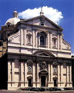
The art of this time, as we know, was characterized by more action, increased excitement, vivid, dramatic lighting effects of contrasting lights and darks, and motion and emotion; however, the architecture also underwent stylistic changes.  The Roman church Il Gesú features huge, sculptured scrolls which magnificently exemplify Baroque style.  The Baroque period had a distinct architectural style.  It introduced convex and concave push and pull.  The interests were in movement, contrast, and variety.  It contained great importance of feelings expressed, and it brilliantly captured drama.  It has been said that Baroque art did not so much focus on beauty.  In actuality, the artists overwhelmed and quite possibly confused their viewers with a blended world that mixed reality and imaginary imagery.  This is the façade of the building (a façade is simply the front of any cathedral structure).

Friday, May 10, 2013

Spanish Baroque (pt. 4)


Also appearing in Spain during this time were the works of Jusepe de Ribera, who also toured and worked in Italy.  This painting, if not his crown achievement, is at least well-regarded in the art history circle of scholars and art critics.  This is The Blind Old Beggar, a painting based on a Spanish novella that had been newly published at that time, called The Life of Lazarillo de Tormes and of His Fortunes and Adversities (published in Spanish).  In the story, Lazarillo is told to have come from humble beginnings.  As a boy, he was given to a blind man for adoption.  Their relationship was not a good one, and the boy was unhappy.  He eventually adopted the old man's shrewd cynicism, despite his extreme dislike for his guardian while serving under him as a child.
In Ribera's painting, the background is dark, perhaps to signify the pair's unpleasant relationship.  The boy stares out from the painting with sharp eyes as if he is looking at the world cynically, like the old man.  The boy's eyes are probably the most moving aspect of the work.  The painting uses dramatic lighting and realism to paint an old man and a young boy standing together in the shadows.  They juxtapose their surroundings, and they juxtapose each other.  Their faces contrast against the darkness; the old man's wrinkles contrast to the young boy's smooth skin.  Everything, it would seem, is at disunity, two or more worlds clashing together in tension and unrest that makes the painting so dramatic.  Again, the boy's facial expression and the look in his eyes, while culminating the emotion in the painting, is, I would argue, one of the most profound images in the history of art.

Thursday, May 9, 2013

Spanish Baroque (pt. 3)


As per usual to the style of Spanish Baroque art, Bartolome Esteban Murillo, an artist who worked in Seville, painted this biblical scene.  Murillo's Return of the Prodigal Son perfectly reflects the spirit of the time.  The religious war between Catholics and Protestants was at an all-time high, and both the Protestant North and the Catholic South would represent their ideological views in the paintings their artists produced.  Spain, as I said, frequently glorified saints, martyrdoms, and religious scenes in order to persuade Catholic defectors, as well as Protestant heretics, to stop rebelling and join the supposedly one, true church.
In this painting we see before us the moment of Jesus's well-known parable when the prodigal, or wasteful, son returns home after squandering his inheritance and spoiling his reputation with sinful and unwise decisions made out of youthful ignorance.  The most memorable aspect of the parable is not that the son returns home; that is to be expected, considering he has no place else to go.  The part of the parable that stays with us is the forgiveness of the father, the loving father who graciously welcomes back his son to his home and even celebrates the homecoming.  Well, likewise this painting demonstrated the subliminal message of the Catholic Church's willingness to forgive and forget the reckless past of any Catholics-turned-Lutherans who would come back and leave their foolish, Protestant ways.  In the painting we see the servants to the left ready to slaughter the fatted calf in celebration of the son's return, and we see a dog, white and pure, the symbol of loyalty, appropriately fitted into the story since the father remained loyal to the son.  A quick word about dogs as a symbol of loyalty.  Dogs are, of course, traditionally man's best friend.  The name Fito comes from the Latin fidelis, which means "faithful."  In art history, a dog almost always represents faithfulness and loyalty.  Here the Catholic Church is pictured to be loyal and forgiving to the Lutherans who had left.

Wednesday, May 8, 2013

Spanish Baroque (pt. 2)


One of the most famous works by Diego Velàzquez is this painting, called Las Meninas (or, The Ladies in Waiting).  Who all is in this painting?  We see the princess and her ladies in waiting, a dog, a dwarf, and a midget.  There is a nun or a nursemaid in the background standing next to (perhaps) a parish minister.  There is a man standing at the far back in the open doorway.  Who is that person?  Mysterious, suddenly ominous and captivating, the figure remains an unidentified man in black.  Velàzquez, the painter of the scene, painted in the scene, stands on the left with a red cross, the symbol of knighthood.  This very curious assemblage of characters constitutes the makeup of this bustling portrait painting.
The daughter of the king is surrounded by servants and attendants, but if we look just above we see a shining mirror at the far wall.  In the frame of the mirror are reflected the king and queen looking at the scene.  (To see this clearly I recommend enlarging this image by clicking on it or finding a zoom-in image of the painting).  This mirror is similar to Jan van Eyck's mirror in the Arnolfini Wedding portrait, and because the Arnolfini portrait was part of the Royal Spanish collection at the time, it is possible that Velàzquez might have seen it and been influenced by it.  The mirror offers another dimension to the painting.  Stick with me on this one…  If the king and queen are being reflected in the mirror in the painting, then that would have to mean they are standing directly in front of the scene in the painting.  The attendants, the princess, Velàzquez, and the man in black must then be looking at the royal couple, not the viewer—or is the viewer the royal couple?  Is Velàzquez promoting his audience to the status of royalty the moment they look at the painting; are we becoming kings and queens by observing art?  What's more, just who are the king and queen looking at?  Are they looking at themselves, their reflection in the mirror, or at the princess?  What is their role in the painting?  The king and queen are not present in the scene; they only appear as a reflection.  What statement does that convey to the governing authority of the Spanish crown—that they are not always present for the scene at hand?  We see only a dim and distant image of the ruling couple; it is the daughter, the princess, the next generation which takes center stage in this portrait.  And is this what Velàzquez is painting?  Notice Velàzquez on the left is looking out towards the viewer (in this case the king and queen) for inspiration for his painting.  Is he actually painting a portrait of the king and queen?  This would appear to be so, for in the mirror the royal couple are standing posed and facing forward, portrait-fashion.  But Velàzquez painted Las Meninas, a portrait of the daughter, and this is it; he cannot be painting the king and queen, can he?  Unless Velàzquez is painting a painting of the ladies in waiting preparing the princess to stand with her family in the painting that Velàzquez is going to paint of them.  But in his painting Velàzquez painted himself painting the scene behind the scene of the painting that Velàzquez painted himself painting.  I promise that sentence makes sense, haha!  To try it once more, Velàzquez paints himself in the portrait as if he is painting a portrait.  But the portrait is in front of him, and the actual portrait Velàzquez produced (Las Meninas) was a behind-the-scenes image and not the actual portrait of the king and queen.  Otherwise, there would have been no Las Meninas; we would instead be looking at a painting of the royal family with their daughter, the princess, standing with them.  Velàzquez paints a different scene…but puts himself down as painting the real scene in the painting.  The easel is turned from the viewer, so we'll never know what Velàzquez from the painting was actually painting—the king and queen, or the painting we are looking at today.

Tuesday, May 7, 2013

Spanish Baroque (pt. 1)


You have to remember that Europe was split at this time.  The Dutch north had converted to Protestantism while the south remained Catholic.  The art of Italy, Flanders, and Spain reflected the agenda of the Catholic church, while new developments in art were being produced in the north, in Holland.  This climate ensued and created the Baroque style of art.  Naturally, there were two typed of Baroque art, representative of the two sects dominating Europe at this time: the Catholic Spanish/Italian and the Protestant Dutch Baroque.  Spanish artists painted saints, crucifixes, and martyrdoms to glorify the lessons and lifestyle of the church in effort to bring as many people over to the Catholic side as was possible.
Diego Velàzquez came from a noble family in Seville and moved to Madrid to develop his artistic skills.  Eventually, King Philip IV requested he paint a portrait of him.  After Velàzquez did this, the king would not allow any other painter make portraits of him, so impressed was he with this new artist's prodigious talent.  Velàzquez painted Philip 34 times.
The largest of Velàzquez's paintings stands over 10 ft. by 12 ft. and is the famous historical painting of The Surrender of Breda.
A strategic piece of propaganda that celebrated Spanish victory over the Dutch city of Breda, the painting captures the moment where the Spanish army receives the keys to the city from the Dutch.  On the side of Breda (the left), the commander bows humbly.  The troops behind him appear clumsy and un-orderly at having lost the battle, while the troops on the right, those of the Spanish army, hold straight, erect spears in numerous sequence, implying the order and superiority that also demonstrates why they won the battle.  The Spanish receive the keys to the city and gesture in gratitude, the idealistic image of gentlemanly, chivalrous conduct.  It is indeed a decidedly friendly scene considering the city of Breda is smoldering in the background.  What is formulaically intriguing about the painting is its structural layout which is designed to bring the viewer right into the scene.  Two men, one soldier from each army and standing on either side of the painting, look out and make eye contact with the viewer, engaging the viewer and bringing him/her into the scene.  The placement of these figures on both sides causes the viewer to look back and forth between both armies and projects emphasis on the center of the painting which houses the action.  The two commanders are the main characters of the scene, and the significance of the event is made clear by the frame around the key.

Thursday, May 2, 2013

Mannerism (pt. 3)


The real name of the artist who became known as El Greco ("The Greek") was Domeriko Theotocopoulos.  His art style used lots of emotion and movement.  After moving to Italy from his native home in Greece, he studied the works of his predecessors, but of course added his own personal touch as well.  Compare his Pietà with Titian's Entombment (Titian on top; El Greco below).

El Greco spent the latter half of his life in Toledo, Spain.  In 1580 he was commissioned by King Philip II of Spain to paint The Martyrdom of St. Maurice and the Theban Legion.  When the king saw the finished product, he thought it was awful and rejected it.
It shows the fate of Maurice and his soldiers, who were (according to tradition) both loyal subjects to the pagan Roman emperor and Christian believers.  Maurice and his soldiers refused to worship pagan deities.  Maurice is explaining the situation to his officers in the foreground; on the left, his men are being stripped naked and beheaded; and above, in Heaven, angels await the martyrs with laurels.
A few years later, the Church of St. Tomé in Toledo hired El Greco to paint the burial of a man who died two hundred years prior.  This massive painting took two years, and the artist considered it his greatest work.
It is The Burial of Count Orgaz.  When the count, a very religious man, died, it was said that St. Stephan and St. Augustine buried him with their own hands.  After the count's death, the villagers would frequently attend the Church of St. Tomé to pay homage to their beloved count; but after a while, the villagers stopped coming.  El Greco's painting was a reminder to the villagers and to all who looked at it that the count ought still to be commemorated.
The painting almost has two halves.  The horizontal line of heads divides Heaven and earth.  The priest looks up to Heaven, where Christ and the angels await the count's arrival.  The young boy on the left points to the saints and introduces you to the scene, and this young boy is none other than El Greco's son.  (A paper coming out of his pocket notes his birth-date).  And the person above St. Stephan, waving at the viewer, could be the artist himself.

Wednesday, May 1, 2013

Mannerism (pt. 2)


Another painting by the artist Tintoretto shows the Mannerist style.  This is the Presentation of the Virgin.
Young Mary climbs solemnly up the stairs to the temple, and although she is the most important figure of the painting, she is small.  The artist intended this to produce excitement in the viewer.  This is a dramatic moment being depicted, and tons of things are exaggerated, as seen in the elongated figures, dramatic gestures, odd perspective, and strange lighting.  It looks realistic enough, but Mannerism exaggerates and deforms (slightly) its figures and subject matter.  It was the reaction to the harmonious Classicism and idealized naturalism of High Renaissance art, concerning itself much with solving intricate artistic problems, such as portraying nudes in complex poses, different, heavily-contrasted lighting styles, etc.  Renaissance art preferred balance and perfection (like the Greeks); Mannerism took to imbalance and an overly exaggerated (almost to the degree of mockery) version of Renaissance ideals.  Surmise from it what you will, and remember that the time of the Reformation was a time of confusion and chaos in the church.  Religious paintings are treated differently, as you can clearly see.
This famous statue of the god Mercury by Giambologna shows the Mannerist style of creating difficult poses that were not natural.  The figures are graceful but disproportionate.